Thursday, July 31, 2014

Crown Point Press

Perhaps it is my West Coast orientation, but Crown Point Press in San Francisco has captured my attention as an important player in the modern printmaking world. It helps that both Richard Diebenkorn and Wayne Thiebaud, two of the gods in my personal art pantheon, worked and published there. It also helps that Kathan Brown, founder and director, is articulate, outgoing, and good at promoting the field of printmaking and Crown Point's own accomplishments. The company's website provides a history of its development, and it also gives a brief description of its character:
Crown Point Press was founded in 1962 by Kathan Brown in order to use traditional printmaking techniques for new art ideas. Crown Point works with artists by invitation who travel from Europe, Japan and various parts of the United States to work with etching in the San Francisco studios. When artists work in Crown Point's studios they are assisted by master printers and the work results in original prints (sometimes called multiple originals) which are hand-printed in limited editions....
I am new to this whole universe, and as usual my approach includes some background research. In the process of web surfing, Crown Point has popped up repeatedly. One of the first entries that caught my attention was a mention of Richard Diebenkorn doing printmaking there. Over the last few months, I have accumulated four books and six DVDs about monotypes and printmaking; half of each are published by Crown Point. There is not a lot of educational material on the website itself, but it does provide a useful summary of the field of printmaking:
In printing, ink is transferred to paper from another material, usually a metal plate or a wooden block. If the plate or block has been worked so it will receive ink in the same way each time it is applied, then there is a matrix and more than one print can be made.
Before electrostatic, ink jet, and other new ways of printing were invented for use with computers, everything was printed in one of only four ways: reliefintagliostencil, and planographic.
The matrix, or ink-holding surface, is different for each one. In relief printing (woodcut) the ink sits on the top surface of a plate or block that has been carved. In intaglio (etching and engraving) the ink sits in the grooves. In stencil printing (silkscreen) there is a hole cut in the matrix and ink is pushed through it. In planographic printing (lithography) the matrix is flat, and the printing part is treated to hold ink, the other parts to repel it.
Crown Point certainly seems to be at the top of the printmaking world, at least in the western U.S. More significantly, on a personal level, its whole history, location, and orientation are very appealing to me. With New Mexico also an apparent center for printmaking, I feel that I am at home in my own region, It is another aspect of the affiliation I feel for this medium.

Friday, July 18, 2014

chine collé

I am intrigued by chine collé, which I mentioned in my post of June 4th, as a way to add texture to my monotypes. I also sense that there may be other reasons to incorporate into my work the thin, fine, beautiful papers that are used for it. They are papers that require support, being too fragile to stand on their own, but they certainly have applications beyond just chine collé. In any case, part of the lure of the monotype world is the chance to learn about, explore, and enjoy paper. I really don't know much about it.

In the most simple chine collé process, a piece of moistened paper with powdered glue sprinkled on its back is laid face-down on top of a painted plate, and this ensemble is inverted onto a piece of damp support paper and run through the press. (At least, this is what I understand so far.) The paper used for this needs to be strong enough to withstand being moistened and manipulated without losing its shape, and must be able to absorb whatever paint or ink is used in the image. I've ordered a jar of rice paste powder, and a sample pack of gampi paper from 
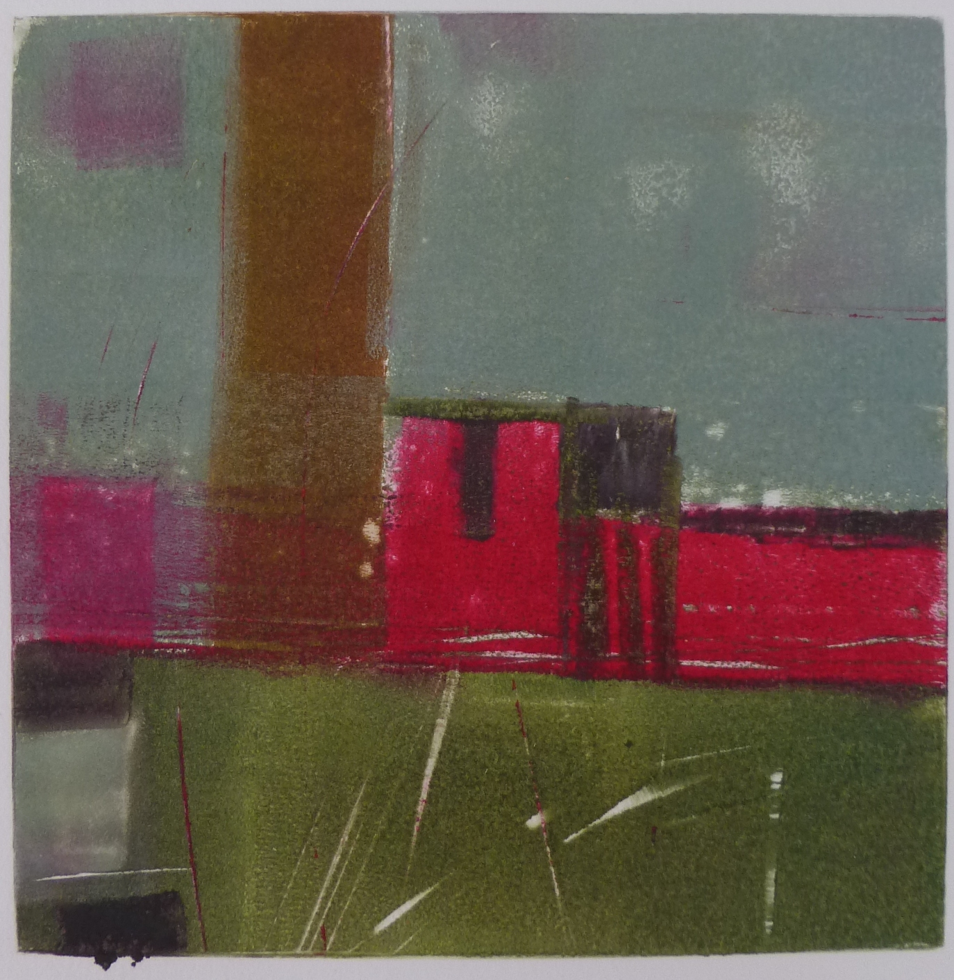
Hiromi Paper, a major importer of Japanese fine papers. Gampi paper is made from the bark of the gampi bush, found in Japan and the Philippines (and maybe elsewhere). It is very thin, strong, and satiny, and apparently is perfect for chine collé work as it takes ink well. Rice paper is also frequently used for chine collé, and I'm sure there are many other papers and even fabrics that can be used. It all depends on the effects that you want to achieve. The image above is a close-up of a piece of rusted cotton-rag napkin that I incorporated into a print in Helper, and shows how the process can enrich a print's surface.

I've also ordered Magical secrets about chine collé by Brian Shure (2009), another in Crown Point Press's Magical secrets series. The book contains both practical information and instruction, and inspirational examples from dozens of artists. An informative DVD is included; actually seeing some of the processes helps a lot. I've barely skimmed the surface so far, watching and admiring, since I don't yet have the materials I need to try it.

I don't know, yet, what role chine collé will play in my monotype work. But the delicacy of the materials, and of the process, represent an aspect of monotypes (and maybe printmaking in general) that appeals to me. There is a lightness, fragility, and elegance that I perceive dancing at the edges of my imagination, qualities that I'd like to bring into my work. I'm not sure just how this will manifest, nor how I will arrive at that goal, but I am happy to be on the road.

Friday, July 11, 2014

color and texture

The Gamblin and Akua inks that I ordered have arrived, but I haven't dipped into them yet.  I have watched a few videos and read a few web sites about using ink for monotype. Most of them show the ink being rolled out onto the plate and then wiped away, and occasionally applied with a brush. The Akua products are particularly well represented online. Their inventors have done a good job of both demonstrating and promoting their products through YouTube. Since the plein air workshop, however, I have let myself continue using my tube oils, exploring the way the paper fiber absorbs the paint, and how to achieve textural effects using tools with which I'm familiar. The three images here are representative of my efforts.

I'm not sure why I'm delaying getting out the inks, except that I am enjoying the tube paints so much. In the meantime, I did order a few supplies that seem appropriate. From Gamblin, some relief ink in Hansa yellow light to use as a primary color along with the blue and red hues I purchased earlier. Also some "burnt plate oil #000", which apparently is the appropriate medium to use with the relief ink, rather than linseed oil or Liquin. This detail came from Gamblin's online article "Monotype: The painterly print." Gamblin also provides good information about their inks on their website, though they offer no instructional videos.

Takach, the manufacturer of my press, also provides many printmaking tools and supplies. From them I ordered a set of small (narrow) specialty brayers designed for printmaking. I had seen these at a workshop several years ago, and had considered getting them for cold wax work. But they are expensive, and I never did. The finer work required on monotype plates makes their purchase seem more justifiable. Also from Takach, I ordered a set of Akua applicators, small squeezable bottles with very fine tips that are used to draw fine lines on printing plates. So soon, I will have more supplies and tools for my work.

Eventually I will have no further excuses for not trying the inks.