Wednesday, December 17, 2014

learning curves

Jerome and I traveled to Santa Fe last week, where I participated in a three-day workshop in monotype from master printer Ron Pokrasso. In what Ron calls his "Layers and Plates" approach, multiple plates are prepared for each monotype print, creating layers of effects as each subsequent plate is printed on the paper. Two of my more playful efforts, on 16"x20" plates, are at left.

Echoing Ron's theme, I gained multiple layers of knowledge and information at the workshop. Most of the techniques and tools were familiar to me, at least in the abstract, but now I was able to see them practiced by someone who put them together in a complex way, using multiple techniques at a time rather than one technique alone. Chine collé, brayering, subtracting paint, stamping, masking, drawing: all might go into any one print. And new techniques, such as using the edge of a brayer to draw, as well as new tools, such as Stabilo's "Woody Pencils", were added to my repertoire.

In addition to the tools-and-techniques aspects of the workshop, it was tremendously helpful to spend three days in a working print studio, with designated workstations for various tasks and processes, and to hear Ron's suggestions about work flow and arrangement of tools. One of the first things I did upon returning home was to rearrange my studio and acquire an additional worktable. I moved the press into the middle of the room, and now have an easier set-up for the whole monotype process. Ron works on Arches 88, an unsized paper that does not require dampening, and uses the Akua line of water-based inks. For the duration of my studies with him (three more workshops through April), I am doing the same, which means that I can dispense with both the space and the time required for soaking paper, The resulting freed-up space is welcome, and makes the logistics of working in my little studio much more fluid.

Friday, November 28, 2014

strata


Judith Brodie's book Yes, no, maybe: Artists working at Crown Point Press arrived earlier this week and has provided hours of stimulation and fascination. I have to remember that the works included in it are largely etching-based, and use materials and techniques that go far beyond monotype. But the book creates fantasies in my head (the section on Diebenkorn and his work is particularly captivating), out of which grew an idea for interpreting my "Colorado Plateau strata" concept through the monotype process. So today I gave it a try.

The process was long, partly because I was feeling my way and partly because, well, it just took a long time. I began by creating three templates (for lack of a better term) using tracing paper. The three are shown layered on top of each other above. The first was a drawing (right) from one of the maps in Ancient landscapes of the Colorado Plateau of Pangaea, the "super-continent" that existed between 300,000 and 100,000 years ago. As that huge land mass began to break apart, the section that became the Four Corners region began its journey to where I live now. The second template was a tracing of the Fremont River and its tributary creeks, from a USGS map of our county. The third was a rendition of an imaginary segmented cliff face (the magenta composition in the final print, below left).

I then created a 12"x14" plate for each of the templates in turn, using the subtractive method. I coated each plate with, sequentially, pale gray, pale brown, and quinacridone magenta, then removed ink with paper towels and cotton swabs to leave only the lines of each image I was rendering. I ran each plate sequentially onto a piece of damp BFK Rives paper to produce the final result.

I can't say that this is a final work, as far as I am concerned, but I did achieve what I had hoped to do. It is a basis on which I think I can build toward that illusive imagined series of prints that reflect my strata theme: multiple passes through the press creating physical strata on the print itself, and images on the plates that also reflect the various aspects of the geology of this place where I live.

Monday, November 17, 2014

combining techniques


Inspired by Howard Hersh's work in Julia Ayres's Monotypes, I spent an intense morning trying to put together my skills and knowledge to date, to produce a satisfying print. I wanted to try blending, masking, multiple runs, and chine collé, all together.

First, I got out my AKUA Intaglio inks, and and blended four warm earthtones. Next, I planned a composition for two passes through the press, dividing the square 8"x8" plate with vertical pieces of tape for an effect of panes. I rolled on patches of the colors I had mixed in a random manner, blending edges to create a soft multi-hued surface, then removed the tape. I scattered pieces of dried grasses and leaves fairly randomly around the surface. The final plate is at left.


I cut and moistened a piece of Japanese rice paper, sprinkled it with wheat paste powder, laid it face down on the plate, and put the whole thing on the press bed. My grid paper for registration shows around the edges of the plate in the photo at right.

A well-moistened piece of BFK Rives 250 gm paper went on top, and I ran the ensemble through the press. The result was a clean but rather uninteresting print, which I'm not bothering to show here. The chine collé process went perfectly smoothly, though the rice paper is not obvious on the print. Also, as it dries, the print is wrinkling; I'll have to research how to press it flat, if possible. The rice paper must have inadvertently gotten stretched, and is contracting as it dries, causing the support paper to wrinkle.


For the second pass, I simply removed the plant matter from the plate, turned it 180 degrees so that the pattern printed differently, and ran the ghost plate on top of the original print, which I laid face up on the press bed to make placement of the plate easier. Some of the remaining ink covered what would have been white paper from the first pass, and other ink transferred to the print and added complexity to the composition. The effect was subtle, but very pleasing. The first pass may have been too densely colored for the full effect of the ghost to come through; I'll have to try more transparent ink, perhaps, or work with ghosts on top of ghosts.

I am pleased with the result, though I think it needs to be fine-tuned. In fact, I was so pleased that I repeated the process for another, slightly different print, left.


Sunday, November 9, 2014

questions of control

 One of the delights of monotype work is the unpredictable nature of the results. Still, I continue to seek some degree of control over both the process and the product. Today I did a single-pass 8"x8" print (at left) that came out as I wanted, except for the center-stage swipe of orange, which did not fade off in streaks as I intended but rather ended in a blob. I may simply not have made the appropriate stroke with the metal putty knife I was using to lay down the orange paint. Part of the problem was handling the paint on the plate, and the as-yet-unanswered question of when a second plate layer bleeds through the first, and when it will stay hidden behind. Is it a question of viscosity? The other, related question was, when is it necessary to wipe out of the first layer and paint into the blank spaces, rather than layer on top?

There are other reasons why I don't like the print: the line between the orange and green areas is too abrupt and needs some transitional marks; the black area comes down too far; the green area is too flat. I thought perhaps a ghost print might be closer to my original idea, but it turned out uneven and unsatisfactory.

Monday, October 27, 2014

learning to control the ink


I did a double-run print today, experimenting with opaque paints and the idea of an underlayer to a top-layer composition. The two plates are on the left in the photo, the underlayer plate at top and the "drawing" plate underneath. At the top right is the intended print, clearly too dark with too much ink. At the lower right is a single-run print that I took off of the already printed "drawing" plate, with an interesting atmosphere but not my original intention.

In principle, my method worked. The underlayers did show through, as I wanted. The problem was in the second plate, whose colors were too close in value and too heavily laid down to give the effect I sought. How to lighten up that second plate? Thinner layers? Greater distinctions in value? Clearer marks?

This was done in Gamblin relief ink.


Friday, September 5, 2014

saturation

An exploration of how much pigment a piece of dampened paper will accept produced the print at left. I used brayers for the flat areas, and brushes and Colour Shapers for the detail work. I am happy with the flatter areas, and especially the nuances in the large blue shape at top. The smaller marks were more problematic: I had less control than I wanted, and did not manipulate the paint well in the central areas. I also applied it too thickly in places for the effects that I wanted. This has caused problems before: I forget to think about what will happen to thickly applied ink when it goes through the press. In part, I don't know how much will get absorbed and how much will get pushed along. Brayers almost automatically produce a thin layer of paint on the plate, but handwork, as it were, produces clumps and lumps that smear when pressed. I wanted those central shapes to be clear rectangles and squares rather than the mushy forms that happened, but I couldn't get the ink to lie flat in such small spaces. A lot of thoughtful practice lies ahead.

Creating monotypes is deceptively painterly, since the main creative work consists of applying ink/paint to a plate. The most salient difference from direct painting on canvas or board is the fact that the resulting print is a mirror image of the painted plate. Yet there are clearly more subtle differences in the actual application of the color to the surface. I need to develop a printer's mentality and orientation, which has led me to decide to let my cold wax medium work lie dormant for a while, and to concentrate on printmaking. Fortunately, there is much useful information on the Web and in the few books I've found on monotypes. Unfortunately, I don't always know what information to seek. This is truly a trial-and-error process for me.

Thursday, August 28, 2014

technique and message


I still haven't broken out the inks for creating my monotype plates, but instead have explored using larger plates than before (16"x20", left, and 10"x14", below) while still enjoying the Gamblin oil paints with which I am familiar. In part, I just wanted to play, though I also seem to be limited to trying one new aspect of printmaking at a time. Baby steps. Producing these slightly larger prints presented no procedural problems: the paper dampened evenly, the plates went onto the press easily, the printing process was uneventful, and the prints turned out quite well. I was focused on these technical aspects rather than artistic questions, so I am content.

In fact, I even borrowed ideas for these pieces, deriving my compositions from paintings I've seen and admired in magazines and books. They allowed me to try new techniques, using stencils, stamps, simple marks (both additive and subtractive), oil sticks, and spritzing, at left, and trying to draw a bit on the slippery plexiglass, below right. These are works that I will not sell; they shall become part of my private archive.  They will be useful as future reference, and they were fun to make.They are not copies, but they are derivative, and indeed do not carry any message that is meaningful to me beyond being attractive and engaging.

This does raise, once again, the artistic question of what it is that I want to paint. I fully acknowledge that simply changing materials and processes is not the answer to the question of why I am painting. But this time, in contrast to the self-inspection as I began to work with oil and cold wax medium a few years ago, I am willing simply to work with the materials and to see what comes from them. At least, that is what I am telling myself. I am on the one hand rather tired of my Colorado Plateau layering paradigm, though on the other hand, it is also familiar and comfortable and still interesting. But my attraction to monotype is in part a desire to try something new, to find a new way to express my affinity for the natural world and the beauty and peace that I find in it. I still want to produce pieces that invoke calm and pleasure in the viewer, and it makes far more sense to paint from the country that I know and love rather than from my imagination. But maybe through printmaking I will get away from my geometric, dense approach and find a different and fresh way to express what I want to say.

Sunday, August 24, 2014

Gamblin inks

The inks I ordered from Gamblin and Akua have arrived, but I am not enthusiastic about trying them. I am enjoying my oil paints so much that I am reluctant to leave them, and I am not sure why I need to. But all the literature talks about using inks, and I remember David Dornan all those years ago in Helper having us use inks for multiple-pass monotypes.

Of the two brands, I am more interested in the Gamblin, at least initially, because the oil-based inks are closer to what I know, and according to the company's website, they can be used together with Gamblin oil paints. Still, I don't really understand why I should use ink. Always helpful, the folks at Gamblin provide a nice introduction to Monotype: the painterly print on their website, in which they recommend the use of their "relief inks" and "burnt plate oil" for monotypes rather than oil paints and linseed oil. But Gamblin also makes "etching inks" and I am not sure what the difference is. Also, the relief inks arrived in cans, but are shown in jars on the website; there, etching inks are shown in cans.

I was confused enough that I wrote to Gamblin asking about all this, and received a lovely reply from Joy Mallari, Gamblin's Printmaking Product Manager. In addition to reassuring me that the relief inks had only recently been changed from jars to cans, she explained,
For monotypes ink works better than oil paint because of the physical properties in the different oils used to make ink and paint. Paint is made from linseed oil. Ink is made from burnt plate oil, basically cooked linseed oil. During this “cooking process” fatty acids are eliminated from the oil vehicle. These acids which are still present in oil paint eat through paper and turn it yellow within a year.
A second inquiry of mine about the viability of paints (did I need to throw out those prints I had made?) brought the following:
I would definitely suggest not throwing those out, as the acidity content can be taken down with the addition of burnt plate oil #000. Unfortunately, there will still be some acidic properties that will yellow the paper over time. However the benefit is that you can still work with some of the vibrant oil colors offered in our oil paint line that aren’t available as inks. Sacrifice vs compromise, for sure.
So I am feeling reassured and a bit more knowledgeable, and willing to dip into the relief inks to see what happens.

Sunday, August 17, 2014

a lot about paper

The collection of sample printmaking papers from Daniel Smith contains some 32 sheets in a variety of weights and colors, ranging from 175 gm to 360 gm in weight, and whites through beiges to blacks. This particular selection of papers was based on what was available at Daniel Smith at the time of my order. The variety of paper appropriate for printmaking is clearly much greater than I thought. I won't know what I like until I try at least these samples, if not others as well. But I would like to understand the important variables so that eventually I can make knowledgeable choices. I have a sense, for example, that the 175 gm and 360 gm weights are too thin and too thick, respectively.

One of the best non-technical overviews I have found on the Internet is Papers for printmaking at the ARTTalk website. On a somewhat more detailed level, the Wikipedia article on paper, as well as articles on cotton paper and sizing, provided most of the following, though I've paraphrased and summarized.

Paper is produced by pressing together moist fibers, usually cellulose pulp from wood, grasses, or rags, and then drying them into sheet form. The process is thought to have developed in China during the early 2d century AD, though archaeological fragments of paper have been found in that region that date back to the 2d century BCE. China and the U.S. are the leading producers of paper today. Most of the printmaking paper I've seen is called "cotton rag", or "rag paper". Cotton paper is stronger and more durable than paper made from wood pulp, which can also be acidic. From the Dick Blick website:
The distinguishing feature of a good printmaking paper is its ability to take a soaking, to absorb a lot of ink, often with multiple runs through a press, without disintegrating or deforming. Fine printmaking papers are made with an archival fiber source, which in the European printmaking tradition is usually cotton. Japanese papers are often made with kozo (mulberry bark), another durable and archival fiber.
To express thickness, paper is gauged by weight. The U.S. uses a system expressed in pounds, derived from the weight of a ream (500 sheets) of a particular paper cut to a particular, undefined size. Photocopy paper, for example, is somewhere around 24 lbs in weight (obviously not the weight of a single sheet, nor even of a ream of 8-1/2"x11"!). But in the printmaking world, paper is weighed according to the International Standard for paper sizing (ISO 216) used most everywhere else in the world. This weight is in "grams per square meter", expressed as g/m2, gm, or just g, and thus ties a specific weight to a specific size. That 24-lb photocopy paper is 90 g/m2. Paper for normal printing is generally between 60 gm and 120 gm. As indicated above, printmaking paper is much thicker.

In order to regulate how absorbent a paper is, sizing chemicals are usually added during the papermaking process to protect or glaze the fibers and force ink or paint to coat their surface rather than penetrate. Starch and gelatin are two examples of sizing substances. (Paper sizing has nothing to do with the physical dimensions of the paper; the term comes from Old Italian sisa, a glue used by painters to prime canvas or paper.) Paper that contains no sizing is called "water-leaf". Blotting paper is water-leaf, which is why it is so absorbent. Almost all other paper in sized internally during the manufacture process, and high-grade bond and writing papers may also be sized with a surface film that makes them very smooth and somewhat water-resistant. The amount and type of sizing used affect the archival quality of the paper.

Printmaking paper needs to have some absorbency, so it can't be  highly sized. The convention, in fact, is to soak the paper for some period of time (I've seen recommended anywhere from 20 minutes to 24 hours), to loosen up the sizing and allow the paper to absorb more detail from the plate.

For now, this seems to satisfy my curiosity.


Thursday, July 31, 2014

Crown Point Press

Perhaps it is my West Coast orientation, but Crown Point Press in San Francisco has captured my attention as an important player in the modern printmaking world. It helps that both Richard Diebenkorn and Wayne Thiebaud, two of the gods in my personal art pantheon, worked and published there. It also helps that Kathan Brown, founder and director, is articulate, outgoing, and good at promoting the field of printmaking and Crown Point's own accomplishments. The company's website provides a history of its development, and it also gives a brief description of its character:
Crown Point Press was founded in 1962 by Kathan Brown in order to use traditional printmaking techniques for new art ideas. Crown Point works with artists by invitation who travel from Europe, Japan and various parts of the United States to work with etching in the San Francisco studios. When artists work in Crown Point's studios they are assisted by master printers and the work results in original prints (sometimes called multiple originals) which are hand-printed in limited editions....
I am new to this whole universe, and as usual my approach includes some background research. In the process of web surfing, Crown Point has popped up repeatedly. One of the first entries that caught my attention was a mention of Richard Diebenkorn doing printmaking there. Over the last few months, I have accumulated four books and six DVDs about monotypes and printmaking; half of each are published by Crown Point. There is not a lot of educational material on the website itself, but it does provide a useful summary of the field of printmaking:
In printing, ink is transferred to paper from another material, usually a metal plate or a wooden block. If the plate or block has been worked so it will receive ink in the same way each time it is applied, then there is a matrix and more than one print can be made.
Before electrostatic, ink jet, and other new ways of printing were invented for use with computers, everything was printed in one of only four ways: reliefintagliostencil, and planographic.
The matrix, or ink-holding surface, is different for each one. In relief printing (woodcut) the ink sits on the top surface of a plate or block that has been carved. In intaglio (etching and engraving) the ink sits in the grooves. In stencil printing (silkscreen) there is a hole cut in the matrix and ink is pushed through it. In planographic printing (lithography) the matrix is flat, and the printing part is treated to hold ink, the other parts to repel it.
Crown Point certainly seems to be at the top of the printmaking world, at least in the western U.S. More significantly, on a personal level, its whole history, location, and orientation are very appealing to me. With New Mexico also an apparent center for printmaking, I feel that I am at home in my own region, It is another aspect of the affiliation I feel for this medium.

Friday, July 18, 2014

chine collé

I am intrigued by chine collé, which I mentioned in my post of June 4th, as a way to add texture to my monotypes. I also sense that there may be other reasons to incorporate into my work the thin, fine, beautiful papers that are used for it. They are papers that require support, being too fragile to stand on their own, but they certainly have applications beyond just chine collé. In any case, part of the lure of the monotype world is the chance to learn about, explore, and enjoy paper. I really don't know much about it.

In the most simple chine collé process, a piece of moistened paper with powdered glue sprinkled on its back is laid face-down on top of a painted plate, and this ensemble is inverted onto a piece of damp support paper and run through the press. (At least, this is what I understand so far.) The paper used for this needs to be strong enough to withstand being moistened and manipulated without losing its shape, and must be able to absorb whatever paint or ink is used in the image. I've ordered a jar of rice paste powder, and a sample pack of gampi paper from Hiromi Paper, a major importer of Japanese fine papers. Gampi paper is made from the bark of the gampi bush, found in Japan and the Philippines (and maybe elsewhere). It is very thin, strong, and satiny, and apparently is perfect for chine collé work as it takes ink well. Rice paper is also frequently used for chine collé, and I'm sure there are many other papers and even fabrics that can be used. It all depends on the effects that you want to achieve. The image above is a close-up of a piece of rusted cotton-rag napkin that I incorporated into a print in Helper, and shows how the process can enrich a print's surface.

I've also ordered Magical secrets about chine collé by Brian Shure (2009), another in Crown Point Press's Magical secrets series. The book contains both practical information and instruction, and inspirational examples from dozens of artists. An informative DVD is included; actually seeing some of the processes helps a lot. I've barely skimmed the surface so far, watching and admiring, since I don't yet have the materials I need to try it.

I don't know, yet, what role chine collé will play in my monotype work. But the delicacy of the materials, and of the process, represent an aspect of monotypes (and maybe printmaking in general) that appeals to me. There is a lightness, fragility, and elegance that I perceive dancing at the edges of my imagination, qualities that I'd like to bring into my work. I'm not sure just how this will manifest, nor how I will arrive at that goal, but I am happy to be on the road.

Friday, July 11, 2014

color and texture

The Gamblin and Akua inks that I ordered have arrived, but I haven't dipped into them yet.  I have watched a few videos and read a few web sites about using ink for monotype. Most of them show the ink being rolled out onto the plate and then wiped away, and occasionally applied with a brush. The Akua products are particularly well represented online. Their inventors have done a good job of both demonstrating and promoting their products through YouTube. Since the plein air workshop, however, I have let myself continue using my tube oils, exploring the way the paper fiber absorbs the paint, and how to achieve textural effects using tools with which I'm familiar. The three images here are representative of my efforts.

I'm not sure why I'm delaying getting out the inks, except that I am enjoying the tube paints so much. In the meantime, I did order a few supplies that seem appropriate. From Gamblin, some relief ink in Hansa yellow light to use as a primary color along with the blue and red hues I purchased earlier. Also some "burnt plate oil #000", which apparently is the appropriate medium to use with the relief ink, rather than linseed oil or Liquin. This detail came from Gamblin's online article "Monotype: The painterly print." Gamblin also provides good information about their inks on their website, though they offer no instructional videos.

Takach, the manufacturer of my press, also provides many printmaking tools and supplies. From them I ordered a set of small (narrow) specialty brayers designed for printmaking. I had seen these at a workshop several years ago, and had considered getting them for cold wax work. But they are expensive, and I never did. The finer work required on monotype plates makes their purchase seem more justifiable. Also from Takach, I ordered a set of Akua applicators, small squeezable bottles with very fine tips that are used to draw fine lines on printing plates. So soon, I will have more supplies and tools for my work.

Eventually I will have no further excuses for not trying the inks.

Saturday, June 28, 2014

a different light

In a break from routine, I had the joy this week of participating in a painting workshop guided by retired professor and excellent artist and teacher Paul Davis, of whom I've written before. Paul lives in Teasdale, a neighboring town to Torrey, and very occasionally offers a week of stimulation and wisdom to a small group of painters. The emphasis this week was on plein air painting, involving neither cold wax nor monotype but rather painting alla prima, as I learned to do with Doug Braithwaite when I first began to paint with oil in 2002. So the workshop provided a chance to explore old skills and habits, as well as equipment -- I had to drag my old field easel out of storage, and beg some Liquin from a friend. Always innovative, however, Paul presented to the group a series of ideas and techniques that stimulated creativity and caused us to look at the process anew.

In addition to the traditional "standing-in-a-field-painting-what-you-see," which we did every morning, Paul led us through some new ways to both think about the process and take it out of its traditional approach. For one thing, we took a photo of the rock formation that we painted on the first morning, then back in Paul's studio that afternoon, we created the same scene as a collage (right). Then we proceeded to paint the formation a second time, from the collage. This was just plain fun, but it also brought insights into planes and angles, light and shadow, and ways to simplify the complexities of a cliff face (or any landscape).

Another day, Paul challenged us to paint the field in front of us not in its actual colors but in a tonalist manner, keeping to light and very close values and neutral hues. Tonalism emphasizes atmosphere, or mood, over accuracy or brightness of color. The photo above shows my easel and a partially finished rendition of the scene to the upper left.

It was refreshing to spend a week away from my studio, among other like-minded and very talented artists, remembering old lessons and learning new ones. It left me with renewed energy and enthusiasm for painting in all its manifestations.

Sunday, June 22, 2014

a few experiments

The studio is set up, and I have all the essential supplies with which to work. Our friend Jan is going to build a couple of shelves to go under the press table in the next week or so, surfaces on which I can store paper and other flat supplies. At the moment, with only the press and my drafting table, I have to shift things around every time I move from one phase of the process to another: tearing paper, putting it to soak, preparing the plate, blotting the paper, running everything through the press, blotting the result, and putting the print to dry between flat surfaces with weights on top. It is somewhat chaotic, and rather exhausting. And it pulls my attention away from the essential creative process. Still, the basic set-up works well, and I am satisfied that my studio can become a comfortable mini printing workshop.


I have completed a series of single-pass monotypes, borrowing ideas from Ayres's book. They are all painted with multiple colors on a single plate, using oil paints straight from the tube and printing onto dampened paper. The process has worked beautifully. I have used brayers to roll on small areas of color arranged around the plate (rather than covering the whole plate and wiping out, as in the multiple-pass technique I discussed the other day). Then I have removed some areas, scratched into others, blended edges, and experimented with oil crayons and and colour scrapers to both add and remove paint. I also have spritzed with mineral spirits to see what kind of effect it produced.

Some of these techniques are similar to those I use with oil and cold wax medium (CWM), but the similarity ends there. The build-up of layers that is the essence of the CWM process and its result simply cannot be done in monotype; the quality of printing onto paper is radically different from painting onto a rigid surface; the absorption of the medium into the paper fibers produces a completely different effect from the build up of layers of wax. Still, some of the mindset is the same, a fascination with color and texture in an abstract approach. As I work from other artists' examples in the book ("how did they do that? can I get the same effect?"), I keep in mind the intention to create my own compositions and messages, once I have gathered a toolbox of techniques. For the moment, the process is what fascinates.


Sunday, June 15, 2014

inspired by Morandi

One of the most intriguing monotype techniques is that of running multiple plates, or multiple passes of a single plate, through the press onto the same paper print. The most common term for this seems to be "multiple pass monotypes." They can be of many flavors, of course, but one technique that I remember from the Helper workshop is to paint each plate with a single color using what is called the subtractive technique: a color is rolled onto the surface of a plate, then areas where that color is not desired are wiped away. On the next pass, another color is used, and wiped away to either show the previous color, provide blank space for the next color, or interact with either (or both) of those colors. A third pass, and color, adds the final touch. When using primary colors, careful planning thus allows for secondary hues as well. And the color of the paper, for example, white, can also be left exposed.

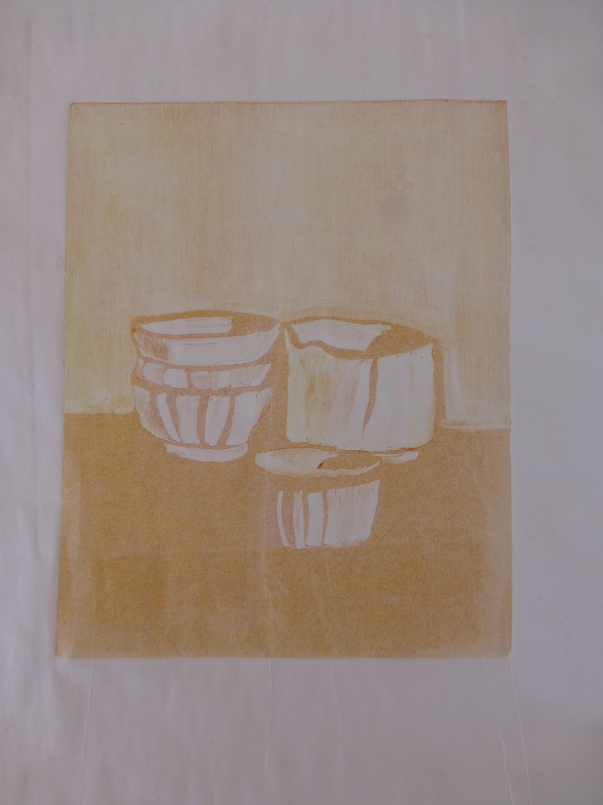
This is so much fun, but it's been a long time since I tried it, and then only once. So I started by borrowing a composition from the work of Giorgio Morandi, one of my favorite painters, which allowed me to focus on the techniques involved. Placing the image under my plexiglass plate, I first rolled out a layer of yellow paint, and duly wiped out areas where I wanted no yellow. I ran this through the press onto my moistened paper. Then I did the same with an orangish color. A print on newsprint off the "ghost" of this plate (the paint that remained after being run through the press) appears at left.

Finally, I created a plate the same way with blue paint, and ran it through onto the paper, creating a three-layer monotype (see above). The ghost of this final plate after it was run through the press is shown below, with the colors from the two earlier passes still lurking below the blue. The image on the plate, of course, is the mirror image of the print.

A major challenge in multiple pass monotypes is that of registration, or lining up second and later plates to print exactly on top of the first pass. There are many ways to do this, from marking a piece of newsprint with the corners or the centers of the plate, and being sure that each sequential plate is lined up correctly, to elaborate grids permanently installed on the press bed. I chose a middle path, and am using an 18" x 24" piece of quarter-inch grid graph paper. Having purchased a pad of this paper, I started out creating a registration sheet for each monotype, but today I created a master sheet, as it were, by marking a center vertical line and marks for 1-1/2 and 2 inch top borders. The quarter-inch grid makes it easy to set both plate and paper down evenly. I put a clear piece of plexiglass, the same width as the press bed, on top of this master registration sheet, and I now have a cleanable, multi-purpose base on which to line up my plates and papers. I can remove it at any time; I just have to increase or lessen the pressure of the press to account for its thickness.

This was such a satisfying exercise, and I plan to incorporate the method into my stable of techniques as I move forward. That said, I created a second triple-pass monotype that turned out badly. In addition to registration being off, the colors did not work well. I think there must be guidelines to follow in terms of what colors to use, and in what order. It is evident from my Morandi piece that combinations other than the three primaries will work, but not just any combination.


Graph Paper 1/4" grid, 18" x 24"

Saturday, June 14, 2014

inks


The first monotypes that I created in Helper all those years ago were done with tube oil paint on plexiglass plates. Phyllis and I used OPEN acrylic paints last week, and although I learned to handle them well and to produce good prints (in the technical sense), I am eager to return to oils. The plasticity of the acrylic medium provides a brilliance of color but also a hard quality to the texture of the paint that I don't like as much as the softness of oils. The image at left is a 6"x6" print using tube oils, the first "keeper" I've run on the press here at home.

I remember that the second time we did monotypes in Helper, we used oil-based inks rather than tube paints. Since the information I've found about printmaking always refers to printing inks, I decided that I had better check them out.

I have long preferred Gamblin oil paints, and the company also makes inks, so I ordered a basic set of primary colors in their "relief" ink, which they say is appropriate for monotypes (in contrast to their "etching" ink; if I sound like I don't know exactly what is what, that's because I don't!).

At the same time, I have read about Akua inks, which are non-toxic, made with soy oil, and can be cleaned up with soap and water as opposed to the mineral spirits or turpentine required for traditional oils. I've heard good things about them from other artists, and the environmentally safe quality appeals, so I also ordered their starter set of primary colors.

So, I'll have two different ink mediums to try, when I have never used any, but I am looking forward to familiarizing myself with them both, and to contrasting ink with my tube oils.

Wednesday, June 11, 2014

books and supplies

The transfer of the press from Helper to Torrey went smoothly, with the help of some able-bodied young men. As I anticipated, it fits perfectly into my studio. Earlier this year, operating on impulse and instinct, I took out the big built-in counter that took up a third of the floor space, and now I know why! I'm sure I will rearrange things as I figure out the most convenient places for my various workstations: the drafting table for preparing the plates, a surface for tearing and blotting paper, another surface for a water bath tray for soaking paper, and the press.

Years ago, when I first discovered monotypes at a workshop in Helper, I purchased Julia Ayres's Monotypes: Mediums and methods for painterly printmaking (2001). I hadn't used it much until now, but it has provided a wealth of information over the past ten days, and I am well aware that at present I am only skimming its surface. Not only is there a wealth of practical information, but examples from several monotype printmakers provide inspiration as well as instruction.

In addition, I have ordered The complete printmaker: Techniques, traditions, innovations, by John Ross (1991). It goes well beyond monotypes, covering just about every possible printmaking technique, and will help me to educate myself about other types of printmaking, and the printmaking field in general. I also ordered Magical secrets about thinking creatively: The art of etching and the truth of life, by Kathan Brown (2006) at Crown Point Press in San Francisco. A DVD and a companion website accompany and expand the book. Again, a resource both practical and inspirational, with stories and examples as well as practical tips.

In the printmaking world of the western U.S., there seem to be a few significant studios, or "presses", establishments that provide rentable space and equipment for printmaking as well as workshops and, sometimes, gallery space. Crown Point Press is one (and evidently an important one); others are New Grounds in Albuquerque; Hand Graphics in Santa Fe, and Saltgrass Printmakers in Salt Lake City. This is all new to me, and I imagine there are others, but my first impression is that this is a relatively small world. I hope to visit each of these studios, eventually.

I have also ordered a few supplies that seem to be critical: a water-bath tray, a paper tear bar, a Plexiglass cutter so I can cut my own plates, some blotters for pressing and drying finished prints, and a quantity of printmaking paper, both a sample pack from Daniel Smith and some white BFK Rives 250 gm sheets. The sample pack will provide the opportunity to explore papers that differ in color, thickness, texture, and sizing, reinforcing the experimental nature of this whole project!

Thursday, June 5, 2014

my own press

It scarcely seems possible, but it looks as though I am going to purchase from David the press that I have been using here in Helper this week. Phyllis and I were sharing the studio's large press, and beginning to get in each other's way a bit, so when I saw a second, smaller press standing idle, I asked David if I could use it. "Sure," he said, "in fact, I'll sell it to you." It had belonged to a colleague who passed away last summer, and David purchased it from his widow.

The press is shown in a photo in the previous post. (It is in the upper left corner of this photo.) It is a table top etching press manufactured in 1989 by Takach Press in Albuquerque, NM. Its bed is 24" by 48", so I can work from small to fairly large sizes. More importantly, it will fit quite comfortably into my little studio at home.

This seems like such a proper fit in so many ways. It is a major investment, and something of a change in direction for me, but it just feels right. With due diligence, however, I contacted Takach Press to find out about its value, and was assured that there is a good resale market for table top presses. I already knew that Takach is one of the premier press manufacturers, and it tickles me to have the New Mexico connection, so close to us and part of the region that I consider home.

I have used the press for three days now, and have become familiar with it. It is in good shape, and I like its size. The work I have been doing (displayed at right) has been very satisfying, and to think that I may be able to continue with it at home is just, well, thrilling. So, even though I can hardly believe it, I plan to drive back to Helper on Monday after I take Phyllis to the airport in Provo, and pick it up. David is even willing to sell me the table it is on.

Apparently I am beginning a new phase of self-expression. At the moment, I am on a steep learning curve about printmaking and presses. It feels almost inevitable, a wave of creativity and energy that is carrying me forward. The right thing at the right time.


Wednesday, June 4, 2014

new challenges

I am in Helper with my friend Phyllis on our annual "art week" of painting together. We decided to spend our days this year creating monotypes, painting onto acrylic plates and transferring the images onto paper using an etching press. This is something I have done before here in Helper, during a couple of Dave Dornan's workshops, and also with Paul Davis at his studio in Teasdale.

The monotype process is both demanding and relaxed, a combination of specific steps that have to be taken in a certain order, and a looseness and unpredictability that comes from the mediated nature of transferring an image from one surface to another. The acrylic plate is unabsorbent and slippery, and the paper is the opposite. There are multiple variables that require management to produce a successful print. Similarly, there are many mediums and methods that can be used to create the plate, and many different papers that can be used to receive the image. It is complex, and yet it has a carefree and very experimental nature.

Partly because of my fascination with all these attributes, partly because it was a break from the oil-and-cold-wax process that I've been pursuing for the past few years, and partly because I had no emotional investment in what happened (and paper is easy just to throw away), doing monotypes this week is invigorating and just plain fun. We are using Golden's OPEN acrylics, which have a longer wet life than traditional acrylics and have extenders that will keep the paint open even longer. After some initial experimentation, they became easy to use. Rather than attempt painting, I've been collecting and pressing leaves and grasses from the Price River banks in back of the studio, and using them as masks between the painted plate and the paper. Sometimes the result is pleasing, sometimes not. The investment in each piece is relatively small; it's kind of like being at art camp.

Phyllis researched a process called chine collé in which pieces of paper are adhered to the paper support as a kind of collage. She brought powdered wheat paste, which combines with the moisture in dampened paper to glue the two surfaces together. The texture in the lower part of the image at the right is rusted paper that I incorporated into a panted monotype plate. The possibilities of the technique are alluring, and I would love to pursue them further. In fact, I would love to pursue the whole monotype process further; it feels light and fun. I haven't considered how monotypes would "fit" into my concept of portraying the Colorado Plateau and its layers and geological complexities, but if I were to pursue this medium, that would be an interesting challenge.

After the heavy self-observation of last fall, this is a delightful and absorbing jump into spring.