Saturday, June 28, 2014

a different light

In a break from routine, I had the joy this week of participating in a painting workshop guided by retired professor and excellent artist and teacher Paul Davis, of whom I've written before. Paul lives in Teasdale, a neighboring town to Torrey, and very occasionally offers a week of stimulation and wisdom to a small group of painters. The emphasis this week was on plein air painting, involving neither cold wax nor monotype but rather painting alla prima, as I learned to do with Doug Braithwaite when I first began to paint with oil in 2002. So the workshop provided a chance to explore old skills and habits, as well as equipment -- I had to drag my old field easel out of storage, and beg some Liquin from a friend. Always innovative, however, Paul presented to the group a series of ideas and techniques that stimulated creativity and caused us to look at the process anew.

In addition to the traditional "standing-in-a-field-painting-what-you-see," which we did every morning, Paul led us through some new ways to both think about the process and take it out of its traditional approach. For one thing, we took a photo of the rock formation that we painted on the first morning, then back in Paul's studio that afternoon, we created the same scene as a collage (right). Then we proceeded to paint the formation a second time, from the collage. This was just plain fun, but it also brought insights into planes and angles, light and shadow, and ways to simplify the complexities of a cliff face (or any landscape).

Another day, Paul challenged us to paint the field in front of us not in its actual colors but in a tonalist manner, keeping to light and very close values and neutral hues. Tonalism emphasizes atmosphere, or mood, over accuracy or brightness of color. The photo above shows my easel and a partially finished rendition of the scene to the upper left.

It was refreshing to spend a week away from my studio, among other like-minded and very talented artists, remembering old lessons and learning new ones. It left me with renewed energy and enthusiasm for painting in all its manifestations.

Sunday, June 22, 2014

a few experiments

The studio is set up, and I have all the essential supplies with which to work. Our friend Jan is going to build a couple of shelves to go under the press table in the next week or so, surfaces on which I can store paper and other flat supplies. At the moment, with only the press and my drafting table, I have to shift things around every time I move from one phase of the process to another: tearing paper, putting it to soak, preparing the plate, blotting the paper, running everything through the press, blotting the result, and putting the print to dry between flat surfaces with weights on top. It is somewhat chaotic, and rather exhausting. And it pulls my attention away from the essential creative process. Still, the basic set-up works well, and I am satisfied that my studio can become a comfortable mini printing workshop.


I have completed a series of single-pass monotypes, borrowing ideas from Ayres's book. They are all painted with multiple colors on a single plate, using oil paints straight from the tube and printing onto dampened paper. The process has worked beautifully. I have used brayers to roll on small areas of color arranged around the plate (rather than covering the whole plate and wiping out, as in the multiple-pass technique I discussed the other day). Then I have removed some areas, scratched into others, blended edges, and experimented with oil crayons and and colour scrapers to both add and remove paint. I also have spritzed with mineral spirits to see what kind of effect it produced.

Some of these techniques are similar to those I use with oil and cold wax medium (CWM), but the similarity ends there. The build-up of layers that is the essence of the CWM process and its result simply cannot be done in monotype; the quality of printing onto paper is radically different from painting onto a rigid surface; the absorption of the medium into the paper fibers produces a completely different effect from the build up of layers of wax. Still, some of the mindset is the same, a fascination with color and texture in an abstract approach. As I work from other artists' examples in the book ("how did they do that? can I get the same effect?"), I keep in mind the intention to create my own compositions and messages, once I have gathered a toolbox of techniques. For the moment, the process is what fascinates.


Sunday, June 15, 2014

inspired by Morandi

One of the most intriguing monotype techniques is that of running multiple plates, or multiple passes of a single plate, through the press onto the same paper print. The most common term for this seems to be "multiple pass monotypes." They can be of many flavors, of course, but one technique that I remember from the Helper workshop is to paint each plate with a single color using what is called the subtractive technique: a color is rolled onto the surface of a plate, then areas where that color is not desired are wiped away. On the next pass, another color is used, and wiped away to either show the previous color, provide blank space for the next color, or interact with either (or both) of those colors. A third pass, and color, adds the final touch. When using primary colors, careful planning thus allows for secondary hues as well. And the color of the paper, for example, white, can also be left exposed.

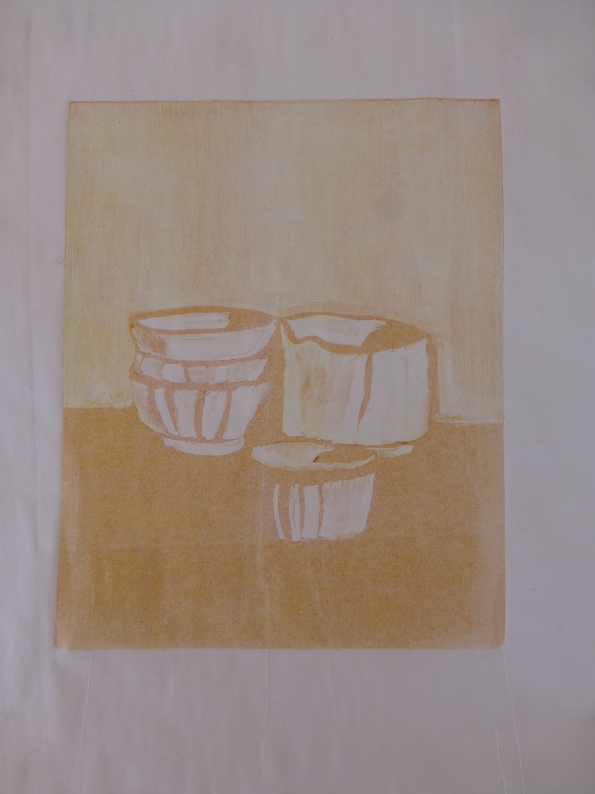
This is so much fun, but it's been a long time since I tried it, and then only once. So I started by borrowing a composition from the work of Giorgio Morandi, one of my favorite painters, which allowed me to focus on the techniques involved. Placing the image under my plexiglass plate, I first rolled out a layer of yellow paint, and duly wiped out areas where I wanted no yellow. I ran this through the press onto my moistened paper. Then I did the same with an orangish color. A print on newsprint off the "ghost" of this plate (the paint that remained after being run through the press) appears at left.

Finally, I created a plate the same way with blue paint, and ran it through onto the paper, creating a three-layer monotype (see above). The ghost of this final plate after it was run through the press is shown below, with the colors from the two earlier passes still lurking below the blue. The image on the plate, of course, is the mirror image of the print.

A major challenge in multiple pass monotypes is that of registration, or lining up second and later plates to print exactly on top of the first pass. There are many ways to do this, from marking a piece of newsprint with the corners or the centers of the plate, and being sure that each sequential plate is lined up correctly, to elaborate grids permanently installed on the press bed. I chose a middle path, and am using an 18" x 24" piece of quarter-inch grid graph paper. Having purchased a pad of this paper, I started out creating a registration sheet for each monotype, but today I created a master sheet, as it were, by marking a center vertical line and marks for 1-1/2 and 2 inch top borders. The quarter-inch grid makes it easy to set both plate and paper down evenly. I put a clear piece of plexiglass, the same width as the press bed, on top of this master registration sheet, and I now have a cleanable, multi-purpose base on which to line up my plates and papers. I can remove it at any time; I just have to increase or lessen the pressure of the press to account for its thickness.

This was such a satisfying exercise, and I plan to incorporate the method into my stable of techniques as I move forward. That said, I created a second triple-pass monotype that turned out badly. In addition to registration being off, the colors did not work well. I think there must be guidelines to follow in terms of what colors to use, and in what order. It is evident from my Morandi piece that combinations other than the three primaries will work, but not just any combination.


Graph Paper 1/4" grid, 18" x 24"

Saturday, June 14, 2014

inks


The first monotypes that I created in Helper all those years ago were done with tube oil paint on plexiglass plates. Phyllis and I used OPEN acrylic paints last week, and although I learned to handle them well and to produce good prints (in the technical sense), I am eager to return to oils. The plasticity of the acrylic medium provides a brilliance of color but also a hard quality to the texture of the paint that I don't like as much as the softness of oils. The image at left is a 6"x6" print using tube oils, the first "keeper" I've run on the press here at home.

I remember that the second time we did monotypes in Helper, we used oil-based inks rather than tube paints. Since the information I've found about printmaking always refers to printing inks, I decided that I had better check them out.

I have long preferred Gamblin oil paints, and the company also makes inks, so I ordered a basic set of primary colors in their "relief" ink, which they say is appropriate for monotypes (in contrast to their "etching" ink; if I sound like I don't know exactly what is what, that's because I don't!).

At the same time, I have read about Akua inks, which are non-toxic, made with soy oil, and can be cleaned up with soap and water as opposed to the mineral spirits or turpentine required for traditional oils. I've heard good things about them from other artists, and the environmentally safe quality appeals, so I also ordered their starter set of primary colors.

So, I'll have two different ink mediums to try, when I have never used any, but I am looking forward to familiarizing myself with them both, and to contrasting ink with my tube oils.

Wednesday, June 11, 2014

books and supplies

The transfer of the press from Helper to Torrey went smoothly, with the help of some able-bodied young men. As I anticipated, it fits perfectly into my studio. Earlier this year, operating on impulse and instinct, I took out the big built-in counter that took up a third of the floor space, and now I know why! I'm sure I will rearrange things as I figure out the most convenient places for my various workstations: the drafting table for preparing the plates, a surface for tearing and blotting paper, another surface for a water bath tray for soaking paper, and the press.

Years ago, when I first discovered monotypes at a workshop in Helper, I purchased Julia Ayres's Monotypes: Mediums and methods for painterly printmaking (2001). I hadn't used it much until now, but it has provided a wealth of information over the past ten days, and I am well aware that at present I am only skimming its surface. Not only is there a wealth of practical information, but examples from several monotype printmakers provide inspiration as well as instruction.

In addition, I have ordered The complete printmaker: Techniques, traditions, innovations, by John Ross (1991). It goes well beyond monotypes, covering just about every possible printmaking technique, and will help me to educate myself about other types of printmaking, and the printmaking field in general. I also ordered Magical secrets about thinking creatively: The art of etching and the truth of life, by Kathan Brown (2006) at Crown Point Press in San Francisco. A DVD and a companion website accompany and expand the book. Again, a resource both practical and inspirational, with stories and examples as well as practical tips.

In the printmaking world of the western U.S., there seem to be a few significant studios, or "presses", establishments that provide rentable space and equipment for printmaking as well as workshops and, sometimes, gallery space. Crown Point Press is one (and evidently an important one); others are New Grounds in Albuquerque; Hand Graphics in Santa Fe, and Saltgrass Printmakers in Salt Lake City. This is all new to me, and I imagine there are others, but my first impression is that this is a relatively small world. I hope to visit each of these studios, eventually.

I have also ordered a few supplies that seem to be critical: a water-bath tray, a paper tear bar, a Plexiglass cutter so I can cut my own plates, some blotters for pressing and drying finished prints, and a quantity of printmaking paper, both a sample pack from Daniel Smith and some white BFK Rives 250 gm sheets. The sample pack will provide the opportunity to explore papers that differ in color, thickness, texture, and sizing, reinforcing the experimental nature of this whole project!

Thursday, June 5, 2014

my own press

It scarcely seems possible, but it looks as though I am going to purchase from David the press that I have been using here in Helper this week. Phyllis and I were sharing the studio's large press, and beginning to get in each other's way a bit, so when I saw a second, smaller press standing idle, I asked David if I could use it. "Sure," he said, "in fact, I'll sell it to you." It had belonged to a colleague who passed away last summer, and David purchased it from his widow.

The press is shown in a photo in the previous post. (It is in the upper left corner of this photo.) It is a table top etching press manufactured in 1989 by Takach Press in Albuquerque, NM. Its bed is 24" by 48", so I can work from small to fairly large sizes. More importantly, it will fit quite comfortably into my little studio at home.

This seems like such a proper fit in so many ways. It is a major investment, and something of a change in direction for me, but it just feels right. With due diligence, however, I contacted Takach Press to find out about its value, and was assured that there is a good resale market for table top presses. I already knew that Takach is one of the premier press manufacturers, and it tickles me to have the New Mexico connection, so close to us and part of the region that I consider home.

I have used the press for three days now, and have become familiar with it. It is in good shape, and I like its size. The work I have been doing (displayed at right) has been very satisfying, and to think that I may be able to continue with it at home is just, well, thrilling. So, even though I can hardly believe it, I plan to drive back to Helper on Monday after I take Phyllis to the airport in Provo, and pick it up. David is even willing to sell me the table it is on.

Apparently I am beginning a new phase of self-expression. At the moment, I am on a steep learning curve about printmaking and presses. It feels almost inevitable, a wave of creativity and energy that is carrying me forward. The right thing at the right time.


Wednesday, June 4, 2014

new challenges

I am in Helper with my friend Phyllis on our annual "art week" of painting together. We decided to spend our days this year creating monotypes, painting onto acrylic plates and transferring the images onto paper using an etching press. This is something I have done before here in Helper, during a couple of Dave Dornan's workshops, and also with Paul Davis at his studio in Teasdale.

The monotype process is both demanding and relaxed, a combination of specific steps that have to be taken in a certain order, and a looseness and unpredictability that comes from the mediated nature of transferring an image from one surface to another. The acrylic plate is unabsorbent and slippery, and the paper is the opposite. There are multiple variables that require management to produce a successful print. Similarly, there are many mediums and methods that can be used to create the plate, and many different papers that can be used to receive the image. It is complex, and yet it has a carefree and very experimental nature.

Partly because of my fascination with all these attributes, partly because it was a break from the oil-and-cold-wax process that I've been pursuing for the past few years, and partly because I had no emotional investment in what happened (and paper is easy just to throw away), doing monotypes this week is invigorating and just plain fun. We are using Golden's OPEN acrylics, which have a longer wet life than traditional acrylics and have extenders that will keep the paint open even longer. After some initial experimentation, they became easy to use. Rather than attempt painting, I've been collecting and pressing leaves and grasses from the Price River banks in back of the studio, and using them as masks between the painted plate and the paper. Sometimes the result is pleasing, sometimes not. The investment in each piece is relatively small; it's kind of like being at art camp.

Phyllis researched a process called chine collĂ© in which pieces of paper are adhered to the paper support as a kind of collage. She brought powdered wheat paste, which combines with the moisture in dampened paper to glue the two surfaces together. The texture in the lower part of the image at the right is rusted paper that I incorporated into a panted monotype plate. The possibilities of the technique are alluring, and I would love to pursue them further. In fact, I would love to pursue the whole monotype process further; it feels light and fun. I haven't considered how monotypes would "fit" into my concept of portraying the Colorado Plateau and its layers and geological complexities, but if I were to pursue this medium, that would be an interesting challenge.

After the heavy self-observation of last fall, this is a delightful and absorbing jump into spring.